Choosing good photo reference is essential when you don’t have access to a live model. In this post I’ll go over the things I try to avoid and the things I look for when choosing my photo reference. It’s a shame when the reference fights you or keeps you from producing a good drawing because it isn’t giving you the necessary information (masses, volumes, shapes, edges, values etc…). There’s a difference between a good photo (solely for photography sake) and good photo reference.
The following is advice on how to choose good photo reference. I’ll be using portraits as an example, but the information can be applied to anything.
Keep in mind… It is possible to get a good drawing from any photograph as long as you know in advance what problems you will need to resolve and how to resolve these problems. However, some photos make our job easier and some make it harder. I’ve found that working from good photo reference makes my job much more enjoyable and inspiring.
Overexposed or Underexposed Photographs
As per one of the wedding photographer cairns You will often hear people refer to these as ‘blown out’ photographs and it simply means that the information in the shadows or light areas has been lost. To fix the problem requires a decent amount of knowledge about your subject (in this case, anatomy of the face) to invent those ‘blown out’ areas.
Overexposed: This happens when the camera lets in too much light causing the light parts of the photo to be a flat white, losing all the halftone information.
Underexposed: This happens when the camera doesn’t let enough light in causing the shadows to be a flat black, losing all the reflected light information.
Flat-Lit Photographs and Extreme Shadows
This is often seen when there is not enough light coming from one single direction (too much bounce light and not enough direct light) or when using a flash. This can make skin appear to be smoother, but the problem is that it doesn’t reveal volumes very well. The feeling of 3-dimensionality is lost. On the other hand, you can have a main light source that is too powerful creating very harsh shadows. It’s about finding the right balance. You want enough bounce light or a secondary light source to soften the shadows, but also enough direct light for it to be clear where the shadows are and where the light is. Finding the right balance depends on the kind of mood or feeling you are going for. Moving closer towards the extreme shadows will bring a lot of drama into your piece. Imagine a scene from a movie like Sin City where the shadows are very dark and the lights are very bright. Moving closer towards the flat light will give your painting a more peaceful and calm feeling, but can sometimes look cartoony if executed poorly.
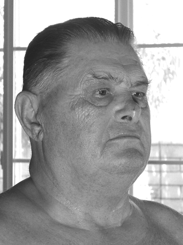
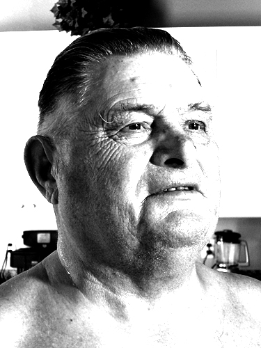
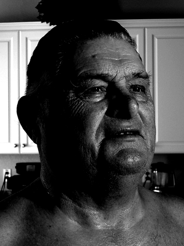
Flat-Lit
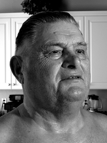
Good Balance
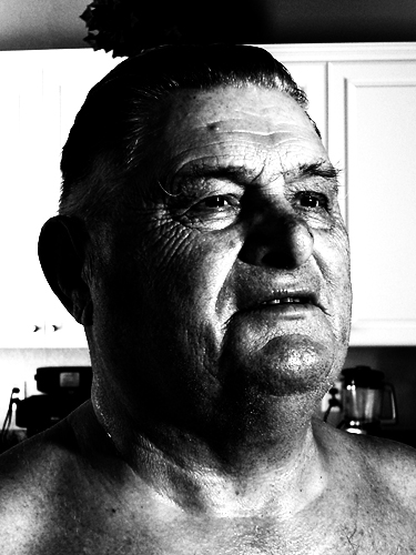
Extreme Shadows
Photos with an obvious light source and a good sense of light and dark are much better for newer artists to learn from, since it’s much easier to see the volumes. Flat light photos require the artist to squeeze every bit of information out of the photo for any halftones, highlights or shadows to show form. Flat light photos are also much more subtle, so value control becomes much more difficult.
Size Matters
Bigger is better… Try to work from photos no smaller than 6 x 8 inches. I prefer 8 x 10. Most of us have a collection of hundreds of 4 x 6 photos in our family albums. Most of these probably have the entire figure in them, making the head only about 1/2 inch in size. That’s way too small to see any detail. Simply blowing it up will usually result in a large, bad photo. I recommend using a digital camera to take your own photos so that you can paint from your monitor. Make it full screen and you’ve got a really big photo. Read more about why I paint from the monitor (In the last section of the post).
Blurry Photographs
Blurry photos make it very difficult to see edges properly. All edges in the photo will appear to be soft, so hard edges will need to be invented. Edges are important to show depth and volume. Trying to fix it with the ‘sharpen edges’ filter in Photoshop won’t work!
Smaller shapes blend together in a blurry photo, so most of the details are lost. Again, more invention required.
Professional Family Photography
Professional family photos are usually not good for reference because there are two different intentions. Family photography places get rid of shadows to make faces look smoother and younger, while a drawing needs shadows to define the forms and look three-dimensional. Cast shadows can create interesting designs, shapes, and pattern compositions with value variation. Light and shadows also create a mood and atmosphere depending on how the subject is lit. The same face can ‘feel’ different just by playing around with the light source. There are exceptions, but I wouldn’t want to paint from most of the ones I’ve seen.
Other Small Tips
Multiple light sources:
This can create problems if both light sources are too powerful and both cast shadows on the face. You can get away with it though, if one light source is obviously dominating the other. Creating rim light by using a secondary light source behind the subject usually works well.
Teeth showing:
Teeth can look lame in a portrait… If solved improperly teeth can end up looking like a piano. Just imagine the Mona Lisa with teeth. If you have to draw teeth, group them together rather than drawing each one individually. I have however, seen it done really well and it added some character to the drawing. Just beware… And make sure you know how to deal with the possible problems.
Note – illustrations are a different story. Teeth can add intensity that an action scene needs. Sometimes teeth are a must to show specific expressions and tell your story.
Good sense of light:
Get a photo that has a very good sense of light falling on and around the forms. Everything you see is dependent on the light that illuminates it. If you can ‘feel’ the light on the subject then it is a good photo.
Is it interesting?
Finally, is the photo interesting? Does it give you a vision of the completed painting? Does it tell a story? Create a mood? Evoke a feeling or emotion? Are you excited to paint it?
Final Check List
- It’s not overexposed
- It’s not underexposed
- It has a good balance between bounce light and direct light
- It’s large enough to see the details
- It’s not blurry
- It has a good sense of light
- I’ve identified the possible problems and I know how to solve them
- I’m excited to paint it